|
|
|
|
Note: Analytics functionality is for cloud customers only.
The Unanet Analytics screen provides users access to their data through custom reporting with ad-hoc style reports (ExpressView), and other advanced report design features to provide business intelligence. Unanet provides some standard reports you can run directly as well as sample report templates, such as reports for GL Budgets, that you can copy to your company or personal folder and further customize. The Analytics screen provides access to dashboard capabilities and graphical views of data.
This screen is available to all roles, however, the data object fields (i.e., data views) will be limited based on roles, organization access, and license. See Available Data Categories/Objects for Unanet Analytics (search for this topic in the Knowledge Center) page for more information.
Administrators have access to all data object fields.
Administrators, P&R Administrators, and Analytics Designers can manage instance reports and scheduled reports, and have access to the Studio folders, reports, and functions (with Studio license).
The Analytics Designer role is available with all Unanet licenses. This role allows the user to have the same access to Analytics as administrators, without needing the administrator role. Data object access depends on other roles given to the user.
This screen is available with the Analytics + or Analytics Studio packages. The following table displays the features available with each package:
| Features | Description |
Analytics + |
Analytics Studio |
| Access to Data Objects | Access Unanet data real-time using ExpressView. |
X |
X |
| Create ExpressView Reports | Create reports using ExpressView. |
X |
X |
| Scheduling | Run reports regularly at specified times. Useful for reports such as weekly project status, DCAA compliance reports, and monthly financial reports. |
X |
X |
| View Standards Reports | Run standard reports supplied by Unanet. |
X |
X |
| Create Advanced Reports | Create complex tabular reports with specific output format. |
X |
|
| Create CrossTab Reports | Create pivot tables where the number of columns are dynamically created. |
X |
|
| Pixel Perfect Reporting | Create reports with specific invoice formats,such as the 1034/1035 cover sheets needed for Government contracts. Available in the Standard Reports folder (1034) and Analytics Studio Reports folder (1034/1035). |
X |
|
| Create Dashboards | Create dashboard to combine reports into one viewing space. |
X |
For more information about the following Studio features, please see the corresponding Analytics help pages by clicking on the help icon in upper right corner-  (see image below) - and searching on the following:

Topics covered on this help page include:
You may also be interested in:
Unanet Analytics (search for this topic in the Knowledge Center)
When you navigate to Reports>>Analytics, you will see a screen similar to the following:

From the Getting Started tab, you can access the following:
ExpressView reports (report designer to create new ExpressView report)
Resource Center (links to the Knowledge Center)
Training Videos (free training courses)
The Reports tree on the left side of the screen displays the folders that contain the reports. You can expand and collapse these folders by clicking on the arrow to the left of each folder. You may see a subset of reports determined by your Unanet roles and organization access.
The Reports tree contains the following folders:
Analytics Studio Reports - Available for Administrators, P&R Administrators, and Analytics Designers with the Studio package. Contains pre-defined dashboard(s) and reports that Studio customers can duplicate to customize further with Studio features.
Sample Report Templates - Contains sample reports from Unanet published to all clients. These have read-only access. In order to modify, you will need to right-click on the report, click on Duplicate, and save in the company folder or My Reports. Click on a report to see the description at the bottom of the page.
Standard Reports - Contains standard reports that you can run directly, such as Pivoted Income Statement. The Duplicate menu option is only available for the Studio package. This folder contains the following ICE (Incurred Cost Electronically) Schedules:
Fringe - for fringe cost pools
Schedule B - for G&A cost pools
Schedule C - for overhead cost pools
Schedule D - for intermediate cost pools
Schedule K - provides a summary of hours and amounts billed on Time & Material and Labor Hour contracts
Company Reports - Each client has its own <Instance Specific> folder that is visible to all users within that instance. It is designed to store client specific custom reports. These reports will be read-only for all except users with role of Administrator, P&R Administrator, or Analytics Designer, which are also able to add and delete reports.
My Reports - You can create and edit your own reports in this folder. This folder and its content are only visible to you.
The Create New Report icon - - allows you to choose from the following (depending on your package):
Click the help icon - - in the upper right corner for more information about the analytics interface, such as report options, navigating the analytics tool, and functionality.
Additional Menu Options/Features for Company Report and My Reports Folders
Upload - right-click on the folder or menu icon -  - and click this option to upload a web report (.wr) file from your computer.
Note: If you upload a report using a data object for which you do not have access, you will not be able to see the report (access restrictions still apply).
Download - right-click on a file or menu icon - - and click this option to download a web report definition file to your computer.
Add Child Folder - right-click on a folder or menu icon - - and click this option to add a child folder under this folder. Available to all users for the My Reports folder and to System and P&R Administrators and Analytics Designers for the company instance folder.
Rename - right-click on a folder or menu icon - - and click this option to rename a child folder. Available to all users for the My Reports folder and to System and P&R Administrators and Analytics Designers for the company instance folder.
Drag and Drop feature - you can drag and drop reports between the company instance and My Reports folders and subfolders. Note that if you move a linked report to a child folder, you must refresh the browser in order for the drilldowns to work in that report. When you refresh the browser, the parent report will update the linked report's path.
The CXO Scoreboard provides key insights into the financial health of your business, utilizing charts and graphs to depict the performance of key metrics in the areas of Cash Flow, Net Income, and Revenue. Performance is measured relative to budgeted values. The scoreboard is available under the Analytics Studio Reports folder. When you run the report, you can enter the following parameters: Legal Entity, Fiscal Year, Fiscal Month End Date, and Budget Name.
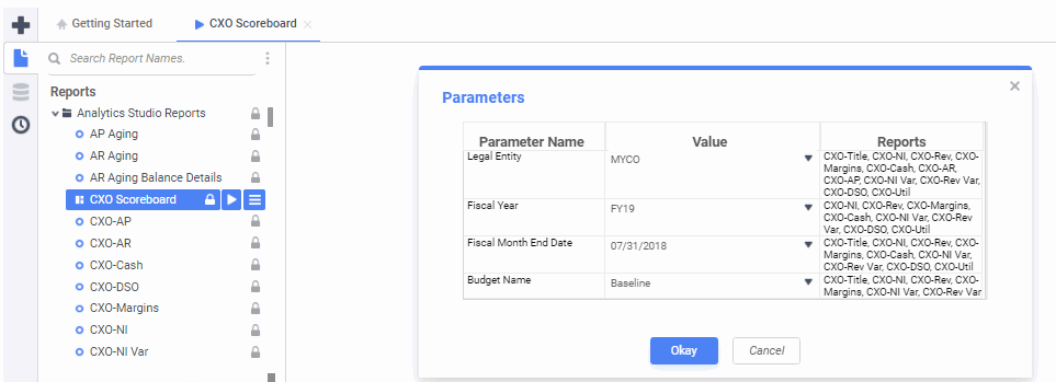
Enter your parameters and the scoreboard will display.
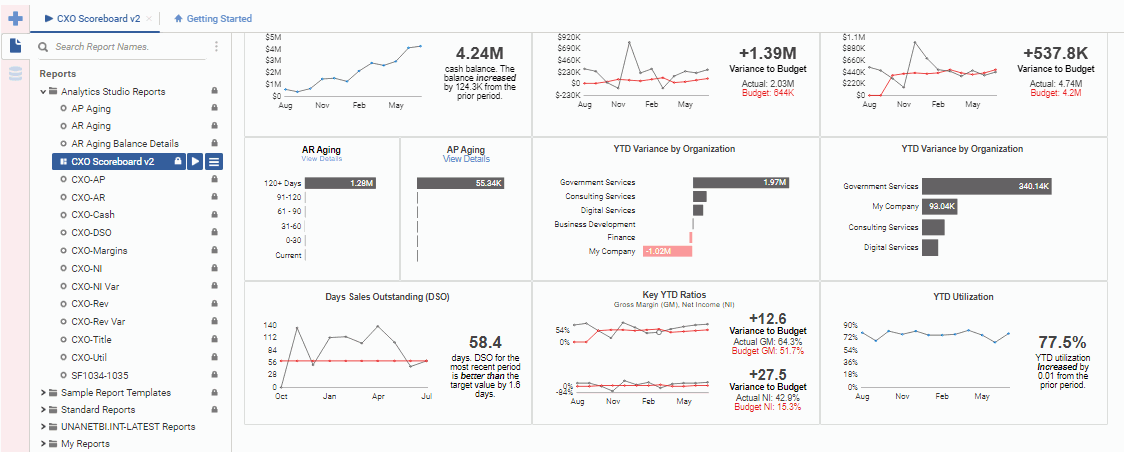
Each column of tiles displays information related to one of our three key metrics (Cash, Net Income, and Revenue) and each row of tiles provides qualitative answers to fundamental business questions across those metrics.
The tiles in the top row display company performance (good or bad) across the three key metrics. The middle row gives additional insights into why the company is performing well or poorly, and the bottom row shows how the company could improve using efficiency metrics.
Following is a listing of the scoreboard tiles:
The Project Central Dashboard is available to Analytics Studio customers. It leverages Project Accounting (JSR) data obtained via Unanet API to highlight project and program control KPIs (Key Performance Indicators) and provides real time project and financial metrics together in one easy to use dashboard. Information is presented in graphs and tabular formats designed to improve project performance.
Important: You must configure the Project Central Dashboard entry in the Analytics Studio Reports folder before using. Please see the Knowledge Center article - "Project Central Dashboard" - for more information.
Select PCD Scoreboard under Analytics Studio reports to run the dashboard. You will be prompted to enter parameters such as project status and number of periods. You can also highlight metrics that exceed certain percentages. The dashboard will resemble the following:
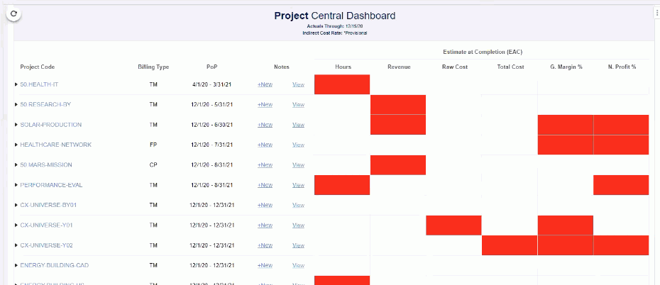
The red boxes indicate problematic areas. You can click on the arrow next to the project code to see details, and you can click on any of the KPI boxes to see detailed performance charts.
The People Dashboard provides human capital KPIs (Key Performance Indicators) to company leadership and offers insight on the current and future staffing needs.
KPIs include: employee count (by location/department), new hire/turnover trend, revenue per employee, employee count, billable utilization, and capacity vs plans.
This dashboard is available under the Analytics Studio Reports folder. When you run the report, you can select the fiscal periods for reporting in the Value column.
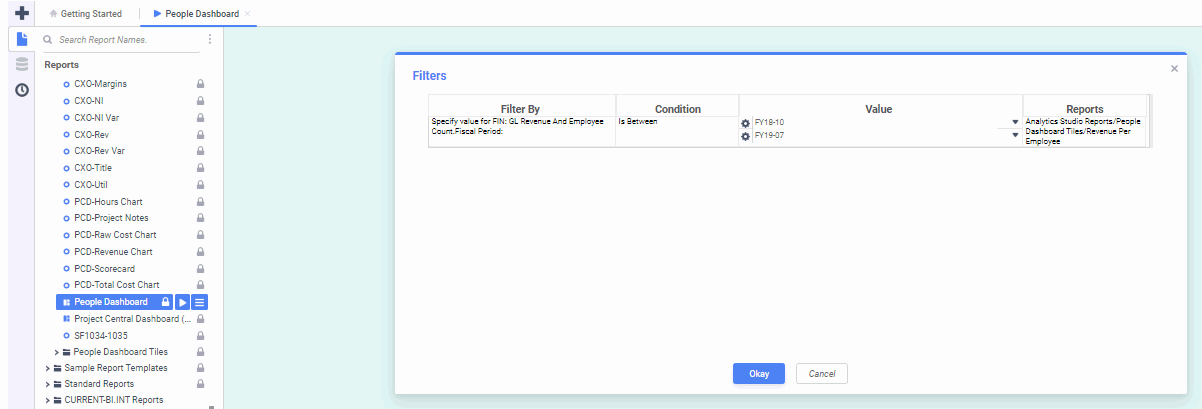
Enter your parameters and the dashboard will display.
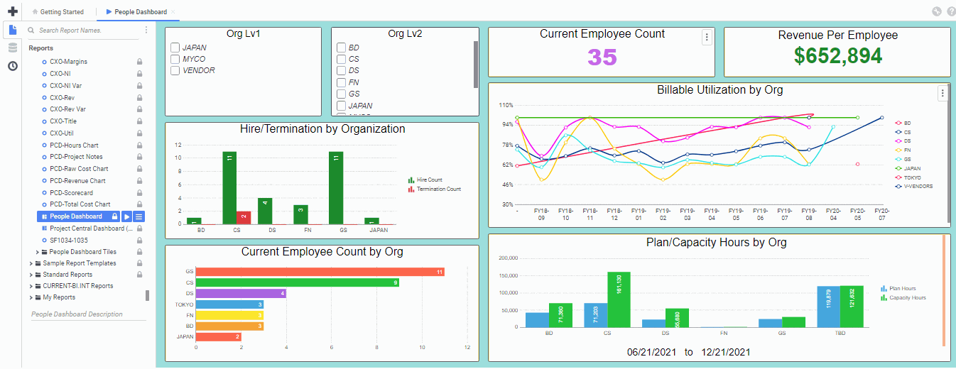
You can further filter the data by selecting items in the Org Lv1 (Legal Entity) and Org Lv2 (financial organization) tiles.
Following is a listing of the scoreboard tiles:
On each of those tiles, you can click on the three vertical dots in upper right corner of each tile to access the following options:
You can change the criteria for an advanced report (indicated by  ) and save that criteria. For example, you can run a report like the one in the screenshot below, change the criteria, and then click the save icon -
  - at the top left of the report. This will save the criteria you selected for the next time you run the report. You can only save one set of criteria per report.
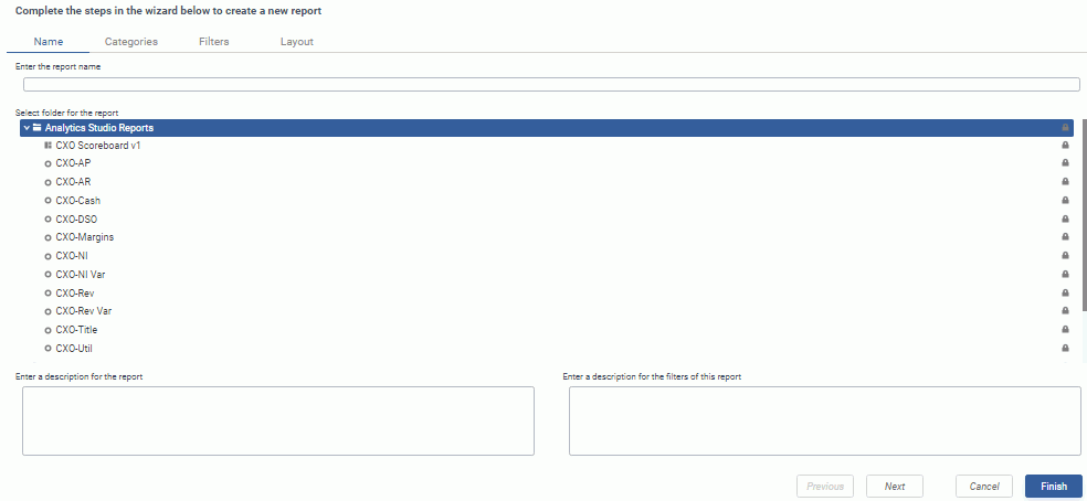
Advanced Reports are included with the Studio package. With Advanced Reports, you can create reports containing charts, maps, gauges, images, and group sections. Use this type of report to provide more flexibility for displaying data.
You can click on the Create New Report icon -- and then select Advanced Report. You will see a wizard similar to the following:
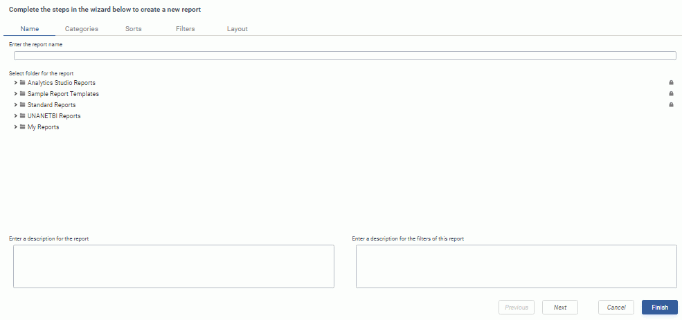
You will see the following tabs:
Click Previous and Next buttons to move between tabs. Click the Finish button when finished entering information.
For more information about Advanced Reports, please see the corresponding Analytics help pages by clicking on the help icon in upper right corner- - and searching on "Report Wizard".
CrossTab Reports are included with the Studio package. With CrossTabs, you can create a cross tabulation for grouping and summarizing data fields that automatically expands columns and rows depending on the number of data groupings. Use this report type when you need two-way tables, contingency tables, or pivot tables.
You can click on the Create New Report icon -- and then select CrossTab Report. You will see a wizard similar to the following:
You will see the following tabs:
Click Previous and Next buttons to move between tabs. Click the Finish button when finished entering information.
For more information about CrossTabs, please see the corresponding Analytics help pages by clicking on the help icon in upper right corner- - and searching on "CrossTabs" or "Report Wizard".
Dashboards are included with the Studio package. Dashboards allow you to combine several related reports into one unified viewing space. Use this option when you need to combine reports, visualizations, images, charts, maps, gauges, text, and web pages.
You can click on the Create New Report icon -- and then select Dashboard. You will see a screen similar to the following:
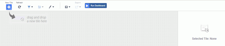
You will see the following icons at the top:
 Select a tile to drag onto the canvas. You can choose from Visualization, Existing Report, URL, Text, Image, or Filter.
 Refresh the data in all tiles on the dashboard.
 Create an interactive filter or drag an existing filter to the canvas.
 Set parameters if dashboard has reports that contain parameters.
 Set dashboard styles such as backgrounds and borders.
 Save dashboard to a folder.
 Export reports and visualizations to Excel, PDF, RTF, or CSV.
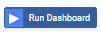 Launches the Dashboard Viewer.
For more information about Dashboards, please see the corresponding Analytics help pages by clicking on the help icon in upper right corner- - and searching on "Dashboard Designer".
Chained Reports are included with the Analytics + or Analytics Studio packages. With Chained Reports you can combine multiple related or disparate reports into a single report.
You can click on the Create New Report icon -- and then select Chained Report. You will see a wizard similar to the following:

You will see the following tabs:
Click Previous and Next buttons to move between tabs. Click the Save and Close button when finished entering information.
For more information about Chained Reports, please see the corresponding Analytics help pages by clicking on the help icon in upper right corner- - and searching on "Chained Reports" or "Report Wizard".
Scheduler is available with Analytics+ and Analytics Studio. Administrators, P&R Administrators, and Analytics Designers can click on the scheduling icon - ![]() - on the left side of the screen to manage report schedules or select a report from the left menu to set up a schedule. Click on the menu icon - - and select either Schedule Report or Email Report. If scheduling a report, you will see a wizard similar to the one below. If emailing a report, enter the email addresses separated by semicolon or comma and select to export as either Excel, PDF, RTF, or CSV. It will be emailed immediately.
- on the left side of the screen to manage report schedules or select a report from the left menu to set up a schedule. Click on the menu icon - - and select either Schedule Report or Email Report. If scheduling a report, you will see a wizard similar to the one below. If emailing a report, enter the email addresses separated by semicolon or comma and select to export as either Excel, PDF, RTF, or CSV. It will be emailed immediately.
Note: If you have multiple reports to send, you can create a chained report and send the chained report.
Click on the scheduling icon to see a list of saved reports similar to the following:
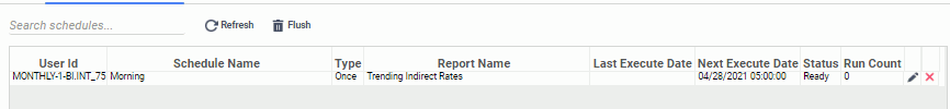
You can refresh the queue to pull in newly created schedules, or flush the queue to remove completed runs.
Click on the edit icon - ![]() - to schedule the report to be sent immediately or later.
- to schedule the report to be sent immediately or later.
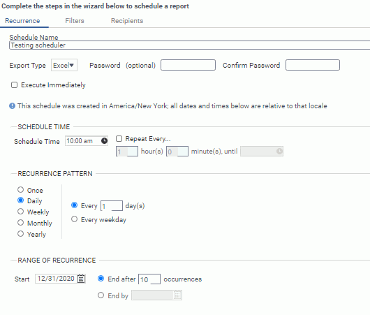
Note that you can schedule the report to repeat a specified number of hours and minutes until a certain time. You can also specify a recurrence pattern.
Click on the Filters and Recipients tabs to enter additional information. Note that the Recipients tab has a Reply To field where you can enter the email address of a point of contact for questions.
Click on the delete icon - ![]() - to remove a report from the list.
- to remove a report from the list.
Adding User's Name to Report
If you want to add a user's name to a report, you will have to concatenate the first, middle, and last names, since they are stored separately in the database. For example, you will need to click the Add Formula link and add a formula similar to the following:
Concatenate({FIN: GL Details.First Name}," ",If(Len({FIN: GL Details.Middle Initial})>0,Concatenate({FIN: GL Details.Middle Initial},". "),""),{FIN: GL Details.Last Name})
Editing Column Heading Names
When designing a report, to edit the column heading names on the report, click on the column heading and then click on the edit icon -  .
.
Data Objects
The available data object fields on the left depend on your license type and user roles.
You can hover over a data object field to see its description.
You can move fields to your report by doing any of these:
Grayed Out Fields
Once you move fields to the report, some fields may be grayed out if they do not join to your report fields in the data model.
Filtering
The performance of a report (including scheduled reports) can be improved by use of filters to decrease the selection, processing, and output of the data. This can help fix reports terminated due to excessive processing time
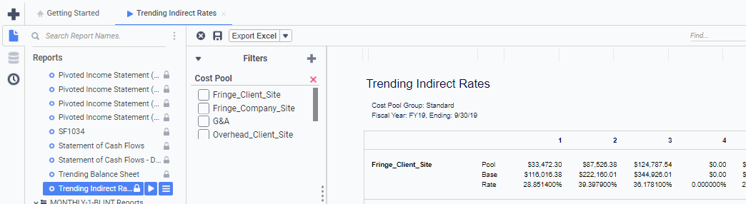
When adding filters, you can add additional fields to the filter by dragging and dropping on existing filters (as in image below). This will add the field, not replace the field.

When filtering, you can click on the settings icon -  - to select whether to search for values that either "Start With" or "Contain" the typed text.
Selecting Text Format Type
When exporting certain fields, like ADM: Account - Account Code, it is best to set these to text format so that the data does not get messed up in the export. To do this, select "Text" for Format Type under Data Formats in the Style menu on the right hand side of the screen.